Dashboard Page
Version 24.3.9120
Version 24.3.9120
Dashboard Page
The CData Sync dashboard provides a visual representation of your key performance indicators (KPIs), metrics, and other relevant data in a consolidated and easily understandable format.
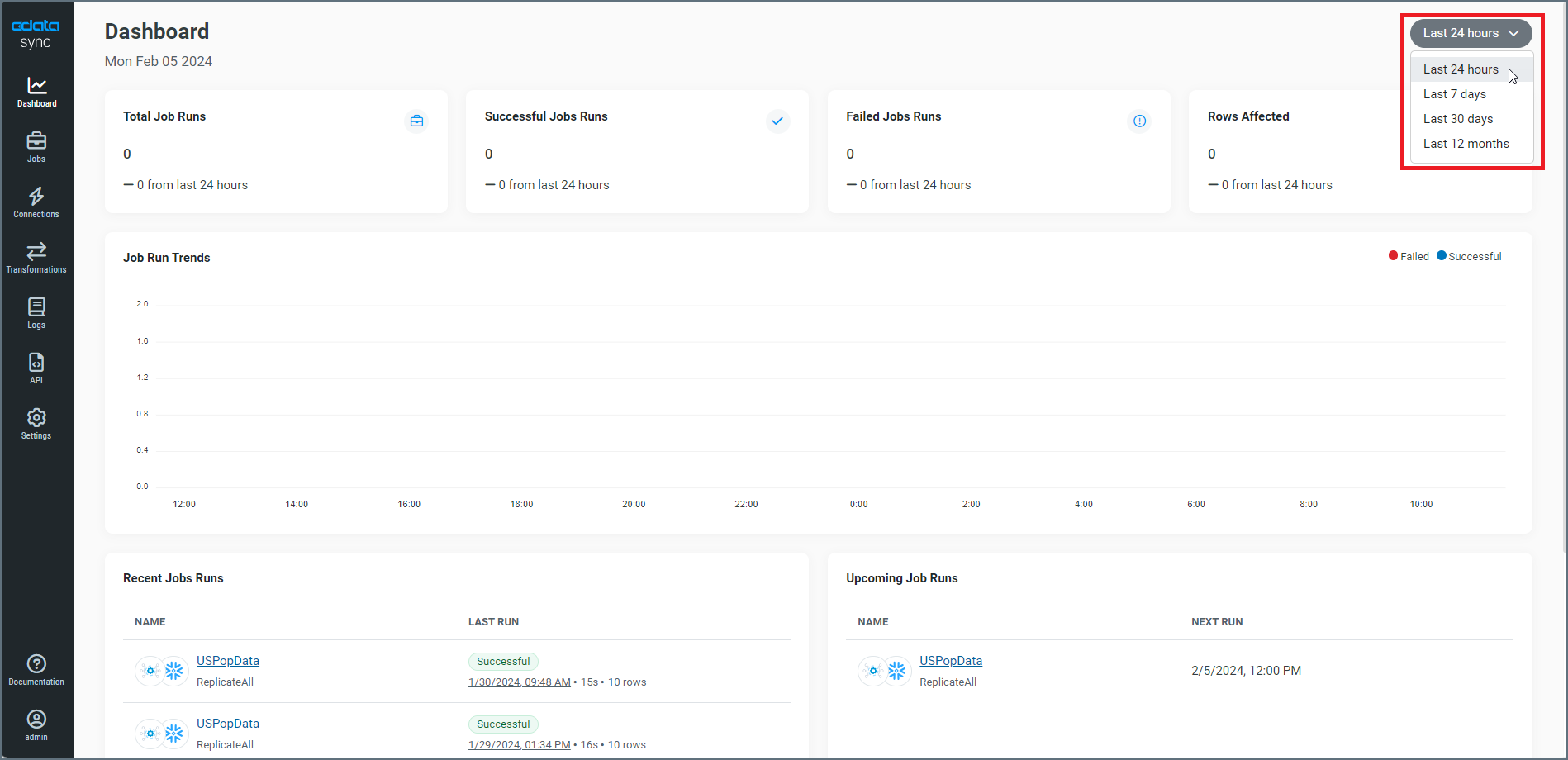
The Dashboard page is the main landing page that is displayed when you open the Sync Admin Console. The Admin Console provides the navigation controls that enable you to access various application pages. Within the console, the Dashboard page provides metrics and KPIs that you need to help you manage your jobs and tasks.

By default, the dashboard displays metrics for the last 24 hours. You can use the button in the upper right corner to display a list from which you can select your preferred time period. You can choose from these options:
-
Last 24 hours (the default increment)
-
Last 7 days
-
Last 30 days
-
Last 12 months
The dashboard displays information categories in three, discrete sections:
-
job-run information
-
job-run trends
-
recent and upcoming jobs
Job-Run Information
The top section of the dashboard displays four information boxes that contain details about your job runs and the rows that are affected.
-
Total Job Runs - Lists the total number of jobs that ran in your preferred time period.
-
Successful Jobs Runs - Lists the number of successful jobs that ran in your preferred time period.
-
Failed Job Runs - Lists the number of failed jobs that that ran in your preferred time period.
-
Rows Affected - Lists the total number of rows that are affected in successful tasks from jobs that ran (regardless of whether the job itself succeeded or failed) in your preferred time period.
These boxes show a trend based on the time period that you select. For example, if you choose the time period Last 24 hours, Sync compares the past 24 hours to the previous 24 hours. In these boxes, the green messages indicate an increase for the metric in that box compared to the previous time period; red messages indicate a decrease compared to that time period.
Job-Run Trends
The middle category presents a graph of trends for the number of successful and failed jobs (y axis) over the run time of the jobs (x axis). Successful jobs are represented in blue bars; failed jobs are represented in red bars. In the following example, you can see that two jobs ran successfully and one job failed in the 8:00 AM hour.

Recent and Upcoming Job Runs
The third part of the dashboard contains lists of recent and upcoming job runs.
-
Recent Jobs Runs - Lists the five most recent jobs that you have run. Each job row contains the following information:
-
Icons that represent your source and destination, respectively, for the job.
-
The job name and a link to the job. Under that link, the replication type is listed (for example, Standard, ReplicateAll, and ReverseETL).
-
A Last Run column, which shows whether the job or tasks succeeded or failed. This column also displays the date and time of the job run, the amount of time it took for the run, and the number of rows that were affected.
-
-
Upcoming Job Runs - Lists the five upcoming job runs that are scheduled. Each job row contains the following information:
-
Icons that represent your source and destination, respectively, for the job.
-
The job name and a link to the job. Under that link, the replication type is listed (for example, Standard, ReplicateAll, and ReverseETL).
-
A Next Run column, which displays the date and time of the next scheduled run.
-